|
There was the common era of the black and white being used broadly. From newspaper to television, medium of communication and entertainment, black and white were always close to the people, which, world love to date, as the combination in logos especially. People to create the identity of the brand, have experimented with colors and combinations, to get and give the best of every type. The logos are organized by keeping the demands of the target audience, but some logos are universal which targets everyone. Just like that, out of many colors, we consider the black and white logos to be comprehensive, which have been working to provide the best for tedious decades. Large companies did introduce their logo, which was simple but effective, having the black and white color, which not only become identity but memory for many years. From the office, with the glass door for entrance to the receipt or invitation cards, the black and white logo always had the eye-catching aesthetics. Imagine having the color logo on the glass door, would that be the attractive enough? I guess no, the sober choice of the colors would be black or white. Just like that, on the visiting cards, if you put various colors from the rainbow, then it may turn cause fleer when people see it. But it does not deny the importance of the logos with the other attractive colors, but the era of minimalism has all the options for various things. Let us look at 15 brand logos, which changed the way people look at it. Nike Nike, the company which took its name from the Greek goddess of the victory, and the brand which does not need any introduction, has the logo of the black color for years. Not only using black and white, but ruling the market for years. The logo by look is the simplest, but the impact is creating the buzz all over the world. The logo of Nike, was introduced in 1971, which was the blue-lined swoosh, and Nike was printed between it. But that logo was not well developed as the logo used to look like any random design, with no unusual aspect and study of the logo design. And in 1985, the black color logo was introduced, and Nike typography was given to it, which has no much different than the recent one but when they introduced that, it had the black box in which the swoosh is completely white with the Nike text given on it. And again, the final and the present logo was introduced in a short time after that. The Black and white colors look like the king colors, besides the goddess name Nike. The only logo that did not get that good response was the first logo design with the blue line with only. And some orange logo was introduced, but that design fed away very early. The black and white logo which prominently showcase to the world the symbol which showcases the positivity, victory, and happiness. For long, that logo was company red color, which defined the passion, according to the company. But the most sober design they thought of creating was the black, which they are using it now for a long time. It had provided the vibes of positivity and well being, as the logo also symbolizes the ‘all right’ or ‘all is good.’ Apple Inc. Logo Apple Inc., who would not be similar to it, of course, most percentage would be. This company had a long history with the logo evolution, starting with the logo of the multiple colors, which gave the color impression of the rainbow in earlier days. After a while, they have changed the approach to the minimalization and made it wholly black or white, with time to time. Currently, the Apple Inc. has the complete black logo in 2019. The giant industry uses these colors because they know the impression of what can be the most satisfying. The soberness and calmness of these colors have connected the broader audience. Suppose, if this company had a colorful logo with various designs, it would not impact the same way. New York Yankees The favorite franchise of the area of US, it had made many fans. And it did not only get popular with as the logo of sports team alone, but the franchise had multiple products in the field of sports have been creating buzz. The New York Yankee logo is not black, but the brown colors with the contrast looks almost black. The first logo which created in 1902, had variations more than desired, many designed was repeated but the most prominent design of the logo was that brown and black contrast logo, which people can see with any product like cap, sports kit, jersey belonging to it. The logo is similar to the majority because of colors and design. Puma The German company, which is mainly famous for the footwear and athletic accessories, also having the black logo for long. The black logo which consists of the design of the leaping puma, also called the panther. The color is nostalgic to many, and the logo symbolizes the courage of the cougar to fly high. Which is also the symbolization of the athlete, who should work faster like cougar and try to fly high, in every sport and field they are contesting in. Adidas The company which is no lesser than any other company in the competition of the footwears, has the most successful logo design for many years. The secret of success is the use of unique color, and often that is black. But at times, they have experimented with various colors, but again they lead the logo with black or white. Accenture The black is having a great time of life, as every giant firm is utilizing it for logo purposes. One of those is the Accenture, which provides software solutions to various people throughout the US and the world. The black logo containing the text of the name and one greater-than sign is penned down above the t in the Accenture, which represent the more the growth and success with time. For more information visit our website: https://www.uptownlogodesign.com/logo-design
0 Comments
Facebook v/s Twitter Facebook and Twitter are two of the biggest social media giants. The controversies between social networking websites regularly go On and Off. Both these social media giants have brought the world close together. With this rapid increase in technology, these social media sites are giving rise to new social media trends. Every day people are getting more social media literate, and developments are going on a whole new level. Facebook is a social networking service, a for-profit corporation owned by the world-famous, Mark Zuckerberg. This social networking site was launched in 2004; it has 1.15 billion plus users worldwide. It can be used via mobile phones, laptops, desktops, and tablet computers. Facebook is a free website and allows everyone to register and create profiles, send messages, upload images, videos, and stay connected. The mission of this most popular social networking website is to give people the power to share and to help make the world more open and connected. 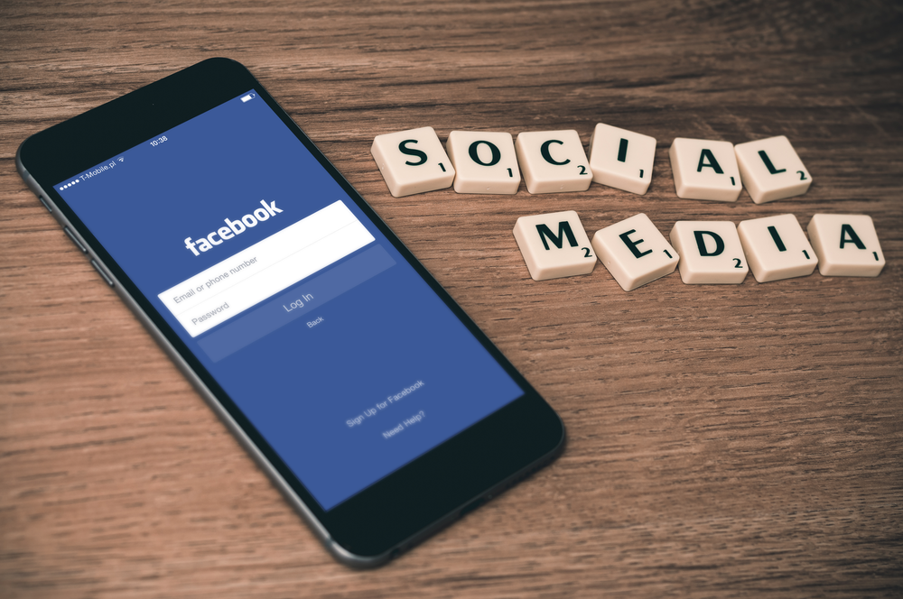 On the other hand, another giant is Twitter, which is an online news, and social networking service. It was launched in 2006 and has 560 million plus users worldwide. On Twitter, users interact through tweets, and the limit of each tweet is only restricted to 140 characters. Twitter’s mission statement states, “To give everyone the power to create and share ideas and information instantly without any barriers.” 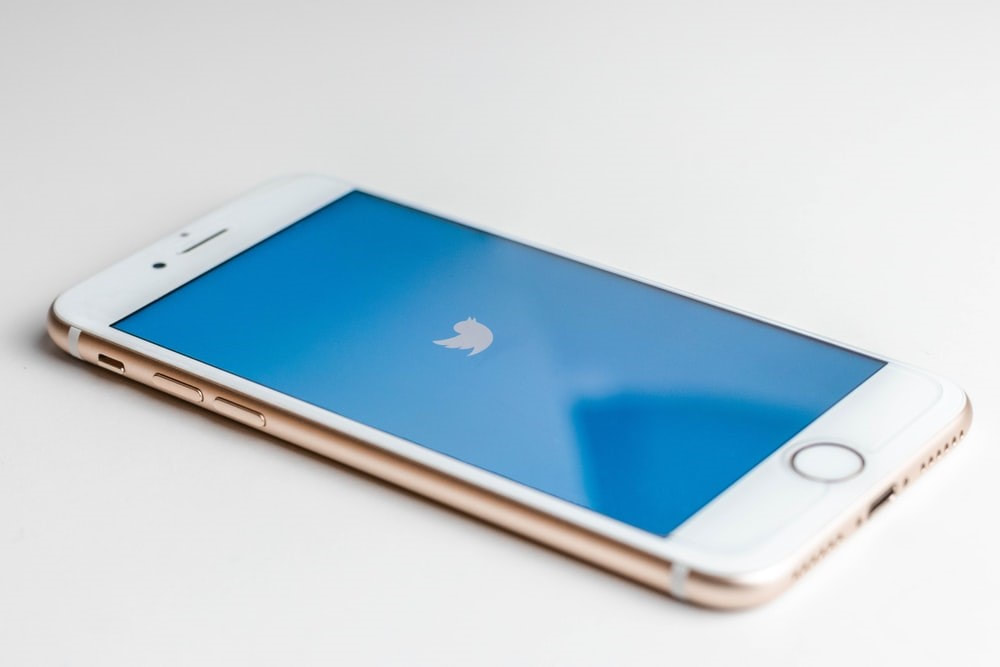 Recently, Facebook unveiled a new logo to distinct its company from its core social network website. The blog was published on Facebook newsroom by Antonio Lucio, Chief Marketing Officer of Facebook, on the 4th of November, 2019, since then people have been showing love-hate reaction to the brand. Background Rebranding logo designs has started as a trend these days. Very recently, Microsoft announced to redesign its logo, which they have not updated for the past five years. Currently, Facebook has also revealed its new brand redesign. This big news was announced in a blog post by the chief marketing officer of the platform, Antonio Lucio. According to him, the redesigning will help customers to better understand about the company, which is behind the apps they are using. Lucio further writes that the brand wants explicitly to differentiate the Facebook app from the Facebook company. This new branding has been designed for clarity, and it has used custom typography and capitalization in order to create a visual distinction between the company and the app. The various apps that fall under the Facebook company brand as enlisted by Lucio include the Facebook app, Instagram, WhatsApp, Messenger, Oculus, Workplace, Calibra, and Portal. All these applications and technologies have been sharing the infrastructure for years, plus the teams that are behind them work together recurrently. Hence, the new FACEBOOK logo will be there on each separate product, new company website, and marketing materials. Twitter’s CEO, Jack Dorsey’s Reaction 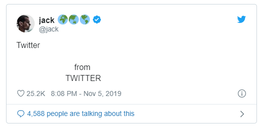 Jack Dorse, the CEO of Twitter, did not miss the opportunity of criticizing. Even though his mocking was not very direct, but the expressions said it all. Other people’s review Dorsey is not the only one mocking the new logo design, political commentators, and tech journalists did not stay behind either. Edward Hardy said that “This is Facebook's new corporate logo Someone spent millions on that.” The Verge's Nilay Patel said, “Facebook letting Mark Zuckerberg personally design a new logo in Word 97 was an interesting choice.” According to Caesy Newton, “The new Facebook logo is just … the opening titles from Succession?” US Senator, Elizebath Warren also tweeted, “Facebook can rebrand all they want, but they can’t hide the fact that they are too big and powerful. It’s time to #BreakUpBIGTECH.” Facebook’s Point of View 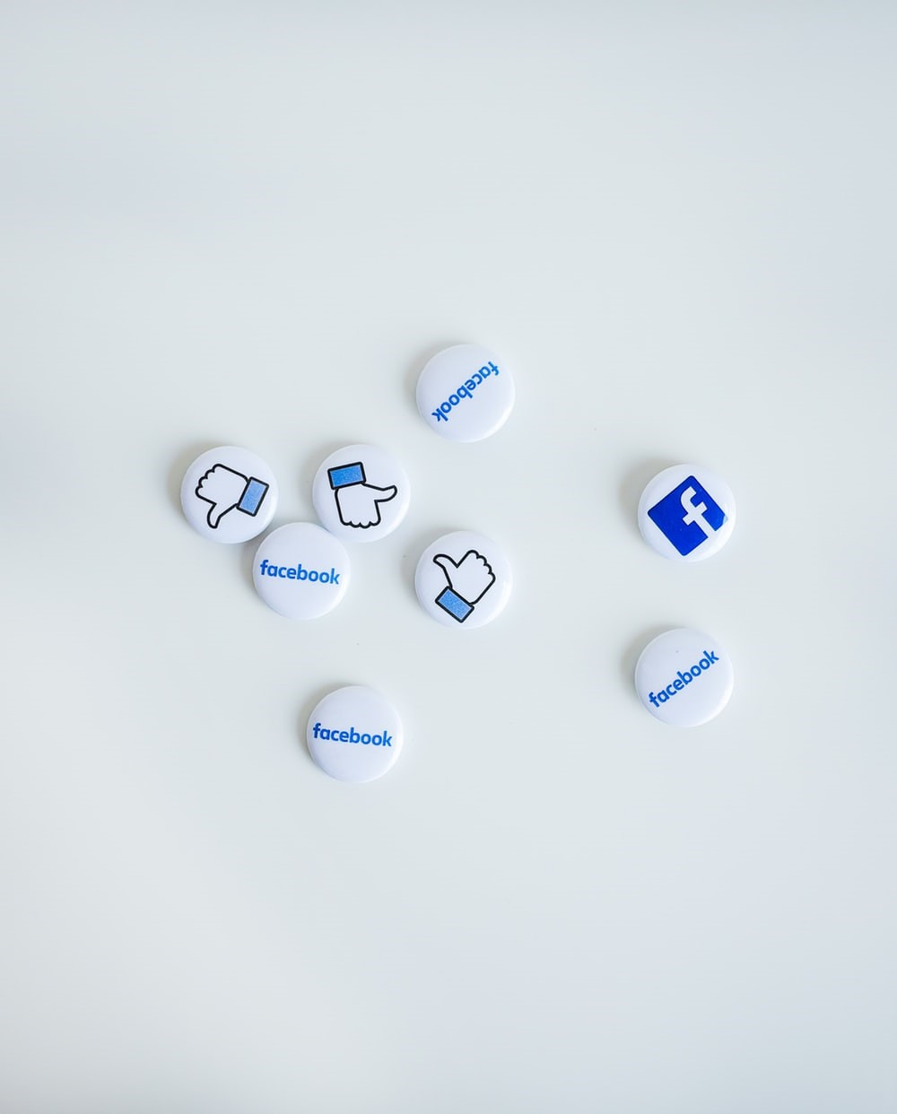 Despite the negative comments and mocking, Facebook is still firm on its decision. According to the company, Facebook has always been using its social network’s word-mark to depict the company as in full length. But now, after 15 years from its founding, Facebook has become far more comprehensive as a parent brand, and the company apparently felt the need to differentiate itself from the social network it was constructed upon.
The company also reported that the new logo has used custom typography and is “designed for clarity,” having the main objective of creating a “visual distinction between the company and the app.” In addition to this, Facebook company says that the purpose of including “from Facebook” is to make people aware that all of its apps have “shared infrastructure” and they rely on many of the same teams. Antonio Lucio, Facebook’s chief marketing officer, writes that “people should know which companies make the products they are using.” However, in the synchronous time, it feels like the new logo might also be an attempt to keep Facebook’s different brands distinguished, and to amid the almost nonstop controversy. These different logo designs seem to portray that Facebook: the company is not entirely defined by Facebook: the social network, perhaps, they just happen to share the same name and controlling interests. Another Announcement In his blog, named “Introducing our new company brand,” By Antonio Lucio, Chief Marketing Officer of Facebook company, he gave the information about the timings when new Facebook brand will officially be in use. He also stated that it will initiate a new company website. His exact words were, “Over the coming weeks, and we will start using the new brand within our products and marketing materials, including a new company website”. The importance of a website in this digital marketing era cannot be denied; the news shows that Facebook company may be laying hands on expanding business even furthermore. Conclusion Even though people have been mocking Facebook, but the brand seems quite confident about their new strategy of distinguishing the company with its applications. There is always a reason behind every change; let’s see with this improvised strategy what drastic change Facebook will offer in the future.  Logos are the fastest way to memorize and hence, recognize a brand. This is why all top-notch companies put great emphasis on designing their logo.
Why is that 80% of Americans can easily recognize the logo of brands like Google, Apple, Nike, McDonalds as compared to the logos of lesser-known brands? Logo is the front door of your brand; it gives the direct entry to your business. It's a greeting. It's an energetic force. It launches first impression. All the world-famous logos have these ingredients embedded down in their logo's identity. You must be pondering over what makes a successful logo design? Successful logos stand out from the crowd, are easily recognizable, and reflect a brand's value. They look timeless, professional, and build instant trust. Successful logos are flexible. They look good in any size, any place. Market trends are ever-changing. However, characteristics like patterns, colors, typography have a massive impact on how your logo will be perceived. And this is something all the big brands have been following that keeps them connected to their audience. Several brands have raised the bar of logos too high. This is because people have always remembered iconic logos due to the incredible success of the brands they represent. We can learn a lot from their brands if we study their pattern and tactics adhesively. Certain brands have been so successful that their logos are forever embedded in our memory. This includes brands like Nike, Coca-Cola, Google, Microsoft, Amazon etc. Do you wonder how the logos of these insanely successful brands are so easily recognized while others fail to achieve the same level of success as them? It's a mind-boggling puzzle. Here we have made things easier for you and listed down five reasons why these brands are thriving. They are designed and shaped correctly The dimensions and shapes of your logo can make a critical impact. Flat designs are generally more successful than intricate ones, Microsoft and Yahoo are perfect examples for this. However, certain beveled logos have also been successful, for example, BMW, Volkswagen, and Mercedes. Plus, if you research the top global brands, you will notice rectangles has been used far more often than any other regular shape. They are simple and clear Simplicity is the real winner. One of the core goals of catchy logos is simplicity. The type of color, design, typeface, size. Everything matters. Most of the famous brands don't have more than two colors in their logo to incorporate simplicity and avoid too much complexity. Consumers will remember your logo far more easily if it only entails one color, which can also become a synonym for your brand. They carry consistency Your brand must have an unmatched consistency that is evident and unwavering. If your logo on a signboard is different from your logo on other brand merchandise, your brand will not achieve the exact success it's aiming for. Neither will it adhere to the look it wants and, therefore, can be challenging to remember easily. Consistent logos help your consumers to remember your brand. While searching for packages on shelves, and they will choose it over your competitors" because they are familiar with it. They are highly memorable A logo should also be significant. And to accomplish this, it needs to be simple and easy to recall. McDonald's golden arches are a perfect example of a logo that stays in mind and stands out from other brands. They reflect the product/services Your logo, in one way or the other, should be able to reflect the product/service you're selling. You can consider Apple, for example. The original logo had Isaac Newton by an apple tree with the words 'Apple Computer Co' incorporated on it. However, the current logo is simple, sleek, just as their products are. The logo is aligned with their products, which are impeccable and sophisticated. Similarly, if you own a restaurant, you wouldn't want a bag to represent your brand but rather a tuna to describe the cuisine you offer. Make it effortless Your logo design is one of the most exciting elements of your brand. However, this doesn't mean that you should incorporate too many details in it and get carried away with your approach. A simple method can make your logo more versatile and flexible that can be used across a wide range of media. Keep it relevant It does not matter how fascinating your logo is, if it doesn't represent your business correctly. Pink is hardly a suitable color for a 'masculine' brand. If your logo is simple and has just one color in it, the typography should be authoritative and visible. If you're having a hard time figuring what kind of logo you should use, you can always do some research on your competitors' brand. Be Loud and Distinctive All iconic brands have been loud and distinctive. They stand out from their competitors regardless of where they appear. While you can always drive some inspiration from your competitors, it is essential to note that you must be unique in your own right. It is also crucial that you have something memorable about the imagery you insert in your logo. The more distinct your logo the easier it is for your potential customer to remember and recall. A lot of people form stable and robust bonds with iconic brands based on the company's long history and abundant popularity that has led to continuous success. For example, people don't purchase shoes from Nike because it's the only shoe brand. Neither are they buying shoes from them because it offers reasonable market rates. But instead, they do so because they are buying the idea that anyone can accomplish anything thanks to the 'Just do it' slogan. All the iconic brands have mastered phycological marketing. These brands spend years and years in crafting a unique personality for their brand that sells concepts and ideas that resonate very clearly with what people want to buy. Iconic brands play a massive part in the everyday life of their consumers and hence enjoy a great deal of brand loyalty-sometimes so much so that other companies can't compete at all. While the features of these iconic brands aren't set in stone, the majority of the experts agree that the following features are what sets these brands apart from their competitors. Their solid historical and cultural attachment: Iconic brands penetrate the beliefs and values of the society. Their logo becomes a visual sign of what the brand offers. It reflects their purposes, values, stories of the target audience. This makes it easier for the brand to connect to even the most complicated of consumers. Their personality and brand image: Even though it's a digital age, iconic brands have identities that prevail in other brands because they are powerful, easy-to-recognize, consistent, and compelling. We offer you high quality logo designs. Their unique story and history: Regardless of what happens, ruling brands remain loyal and faithful to their account. And their logo is an accurate representation of their values. This means that even though trends and brand offerings change and enhance massively, the original brand identity remains constant, and the logo is a visual proof of that. For example, brands like Nike, Adidas, Apple have kept their logos the same for the last two decades, even though their brand has outgrown its original capacity. However, it is essential to note that your brand may follow all these steps and still be not be as iconic or successful as your competitors. Your brand's logo should equate your products and services in parallel to your consumer's expectations from your brand. Having an incredible logo will not save a sinking brand due to inferior quality products. However, if you know your products/services are amazing and carry a high potential, your logo can promise you long term success. Check out Uptown Logo Design to get Iconic Logos Uptown logo design offers you incredible logos that will give your brand an iconic and professional image. Our team of highly skilled and creative graphic designers know how to mold logos according to the client’s requirements. If you’re looking for premium quality and creative logos that represent your brand in its true essence check out our website. Within just 5 years, Uptown Logo has created over a thousand logos for wide range of clientele. 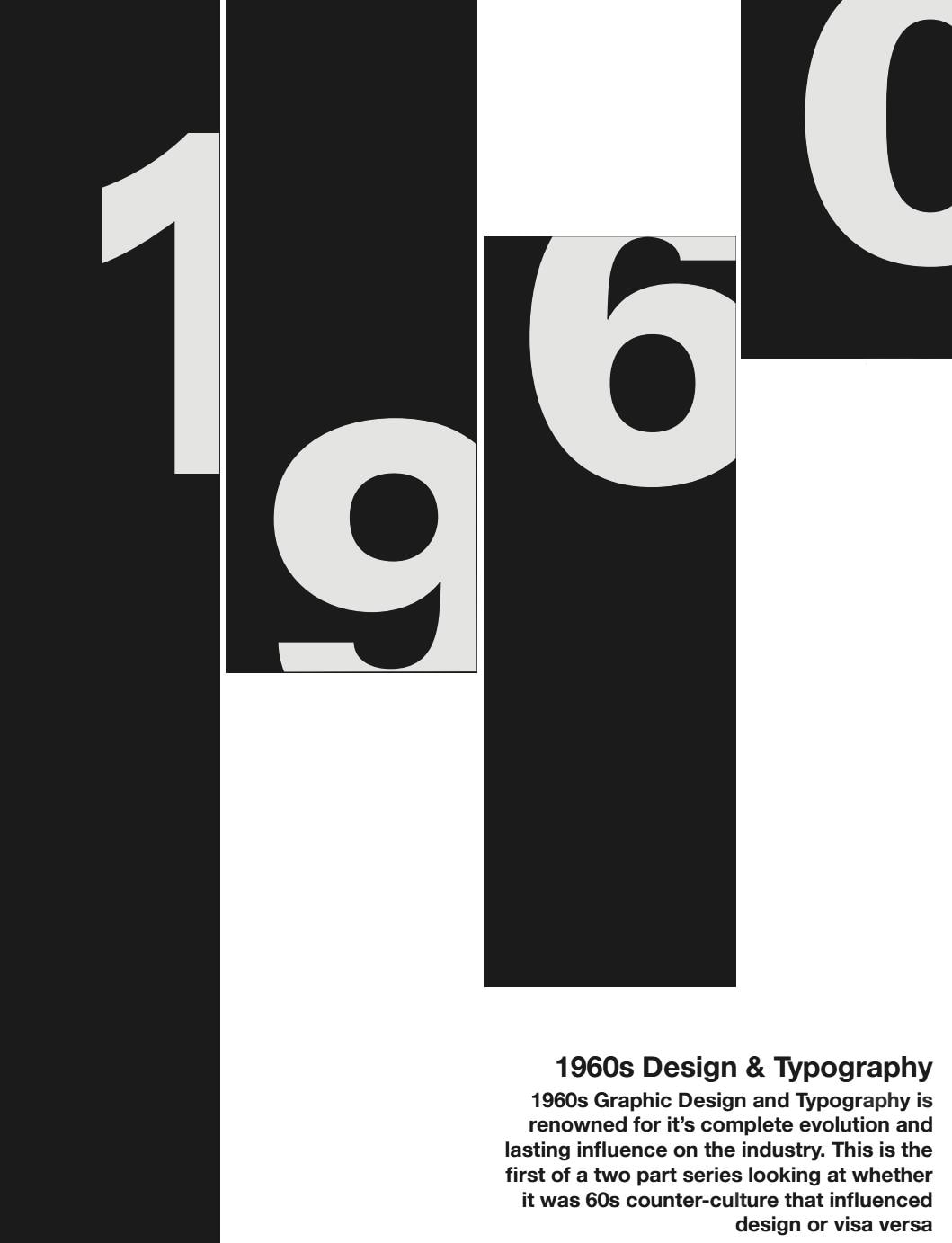 Whenever we think of 1960s, the thing that mostly comes over our mind is the eccentric fashion wave, the hippie culture movement but there’s another thing from the 60s that shaped the current world’s trends- The graphic designs. The initial wave The graphic art in the sixties was divided into two main stylistic groups. Some artworks by artists kept on evolving with modern style that was slightly influenced by the ever-trending Swiss Style, which ended up having a crucial impact on the over all typography and the layout design during the era. A fusion of various ingredients The sixties were also a fabulous time for modernist illustration, having illustrators like Charley Harper making a huge mark in the design universe with his ideology of stylized design on grainy textures with colorful drawings and loud geometric shapes. This simple range of design had a very commercial appeal and found no difficulty in becoming a perfect fit for textile prints, as well as the graphic currency in the highly evolving advertising industry. The Hippie Culture Another massive trending wave in the 60s, was the psychedelic design which was influenced by the hippie, free love, rock ‘n’ roll movements. Also, the increased usage of hallucinogenic drugs affected the subjects of graphic designs. The Return In 2019, the vintage graphic designs of the 60s have taken a comeback with grainy images being used increasingly not just in graphic design but also real-time photography. A fusion of modern art and a vintage, psychedelic, 60s inspired graphic culture is being applied and created in a lot of areas of advertising. Successful brands like Dolce & Gabbana, HnM are quickly implanting the 60s influenced graphic in not just their clothing collections but also the artwork campaigns. 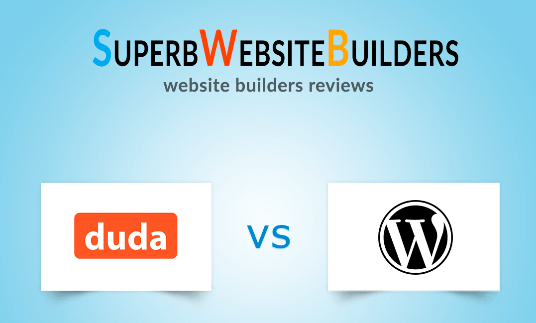 WordPress raises investments
WordPress has managed to secure its position as a leading web development host. What further strengthened its position was the announcement of its parent company’s $300 million raise at their $ 3 billion valuation. That also happened just weeks after Tumblr was taken from Verizon and bought by Automattic. However, that doesn’t end the ruthless competition for WordPress. In fact, they now have to worry about Duda which is one of their leading competitors as of now. What is Duda? You must be wondering, what is Duda? Well, it’s a cloud-based website platform that offers building arena to developers- mostly targeting, traditionally non-technical web developers at Saas platforms and other digital agencies. However, recently they dropped a bomb that could potentially make WordPress a little stressed for their future- that Duda raised $25 million from Susquehanna Growth Equity- a single investor. A new rising star The new funding brings the startup from Palo-Alto to a $50 million investment to date, brings Duda to a milestone achievement within a very short period. Until now there are over 560,000 websites built from the platform. The new kid on the block The CEO of the company Itai Sadan says, the funding will be used to invest in the platform-they already have a massive team of engineers working in Israel along with a team of sales and marketing, to make Duda enter the competition with bigger companies. The Potential Duda initially started off as mobile-first development platform. At that time the company believed mobile web to be a crucial and viable platform that could expand to build native apps for mobile platforms. Duda is definitely on the rise, within just 9 years this Palo Alto based start-up has managed to acquire over half a million worth of investments and is only going to increase in the future! For more information visit our website: https://www.uptownlogodesign.com/web-development/ |
AuthorWrite something about yourself. No need to be fancy, just an overview. Archives
March 2020
Categories
All
|
 RSS Feed
